Client Recognition

Case Study Walkthrough
Role: Sole UX Designer and Researcher
Duration: 5 months
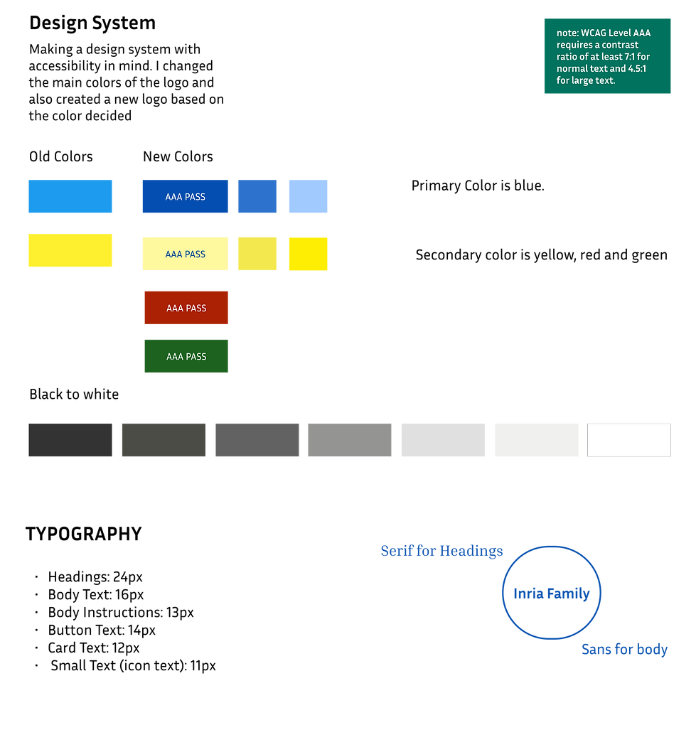
Tools: Figma, Figjam, Google Sheets, Slack, Canva, Material Design, Paper, Pen, Pencils, Sticky Notes
Problem Statement
Planning and managing group trips is challenging due to coordination issues, such as aligning schedules, managing shared expenses, and organizing activities that cater to everyone’s preferences. The lack of an integrated solution forces users to rely on scattered tools like WhatsApp, spreadsheets, and separate booking platforms, creating inefficiencies and frustration.

Solutions
A Centralized Planning Hub for Collaborative Group Trips
1
Integrated Travel Planning Board
2
AI-Driven Coordination
3
Expense Management Tools
4
Real-Time Updates
5
Collaboration Features
Design Process

Discovery
As the sole designer in a team of 10, including 2 stakeholders, a manager, and developers, I collaborated closely with the team to analyze the market and ideate the best approach for the application. We aimed to focus on the golden spot—the intersection of key user pain points and gaps in competitor solutions. Through extensive research, I identified that group trip planning, particularly for 5-8 people, is a persistent challenge that remains underserved in the market. To delve deeper into user needs, we conducted comprehensive research and analysis, including user interviews, surveys, competitor benchmarking, and persona development, ensuring our solution truly resonated with users' feelings and pain points.
User Journey

I focused first on the whole journey of a group trip to understand the problem and avoid any mistakes in solving the wrong issue
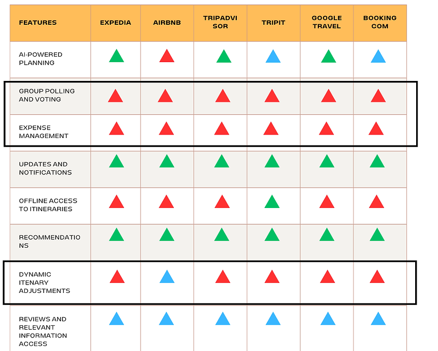
Competitive Analysis
Our major competitors at the moment
MVP’s focus is on solving group voting and budget planning challenges, deferring dynamic itinerary changes for later based on user feedback.
We found major gaps in group voting and expense management during trip planning
Is dynamic itinerary option necessary for MVP?
With consideration of the user stories for the application, I decided to first focus on the planning stage, incorporating emotions to understand the main issues we needed to address to get the best out of our MVP. We identified many gaps and decided to evaluate which would be most suitable for the MVP.
User Planning

Main Target for AI
Do we add user feedback filter to AI in MVP?
" How might we include users' most critical needs in the MVP for the launch? "
Card Sorting
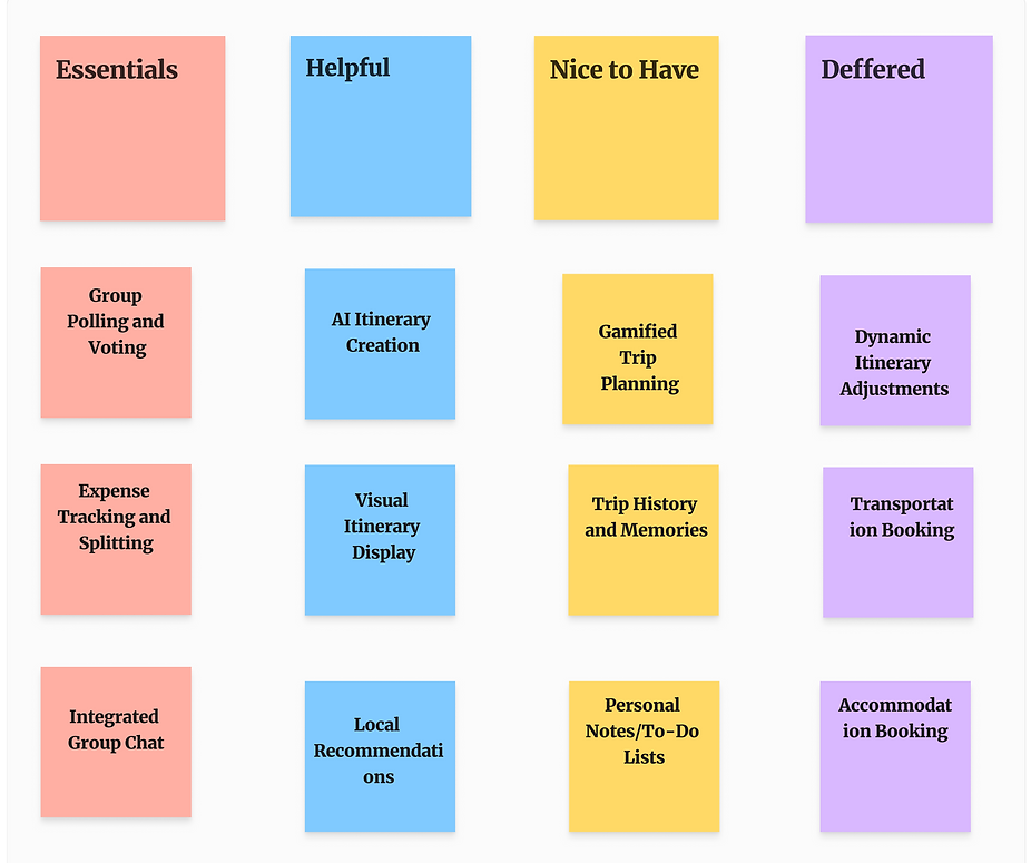
I performed a priortization workshop to understand the importance of the tasks needed for the users and the stories I should focus first on given the time frame
These Cards were the based on the major user story journeys we wanted to include in the application now or in the future!
Dynamic expense tracking and splitting was a major technical limitaion we were facing.
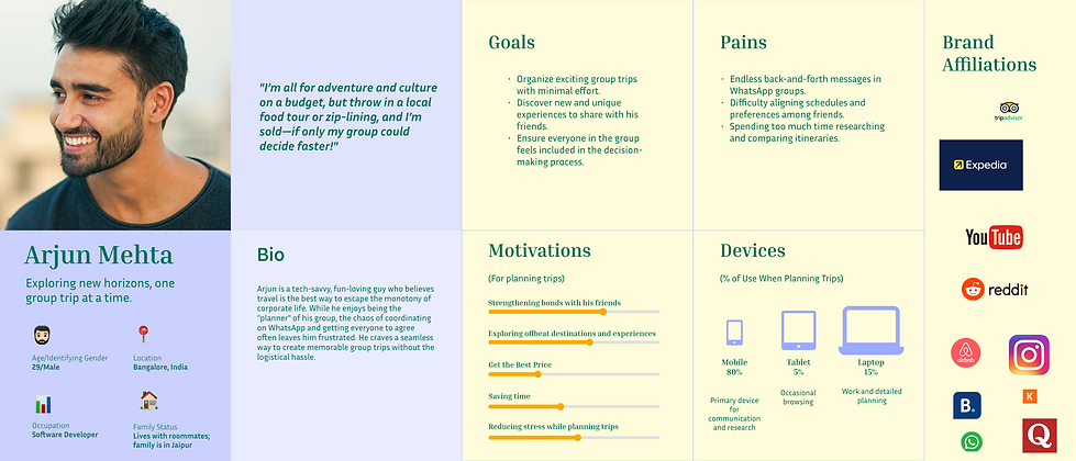
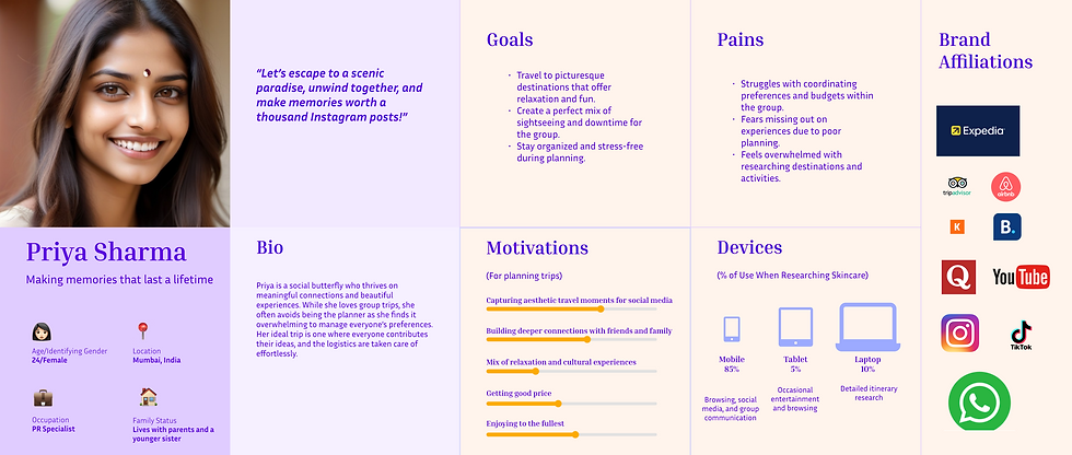
User Personas
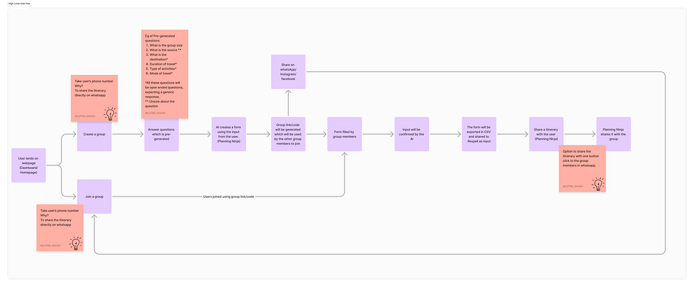
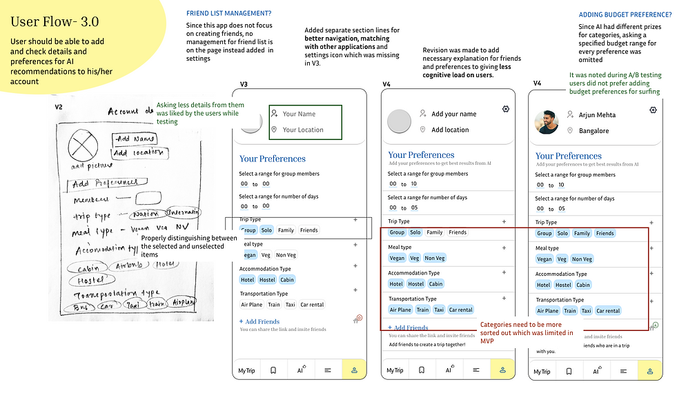
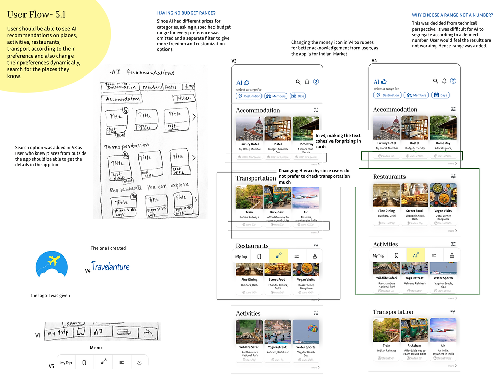
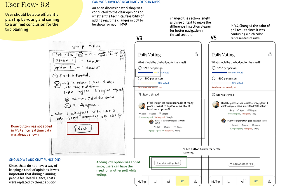
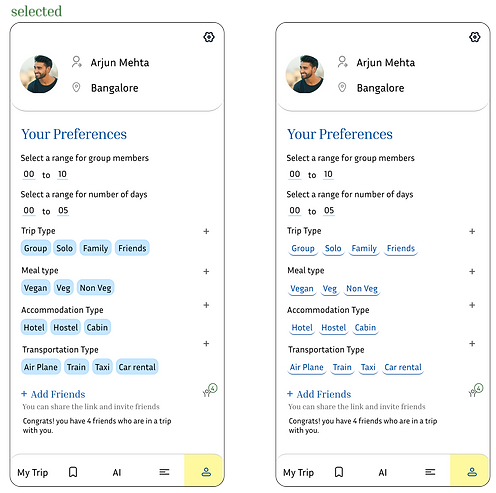
Conceptulised User Flow
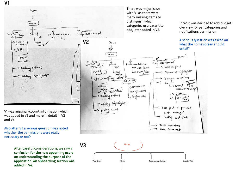
Site Mapping
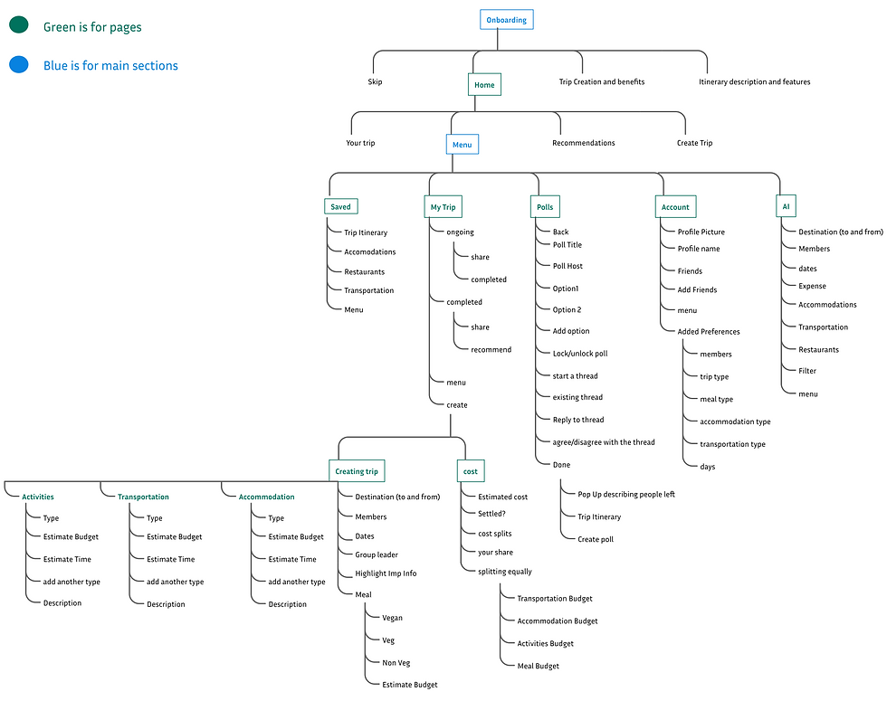
Chosen Sitemap (v4)
Rapid Prototyping
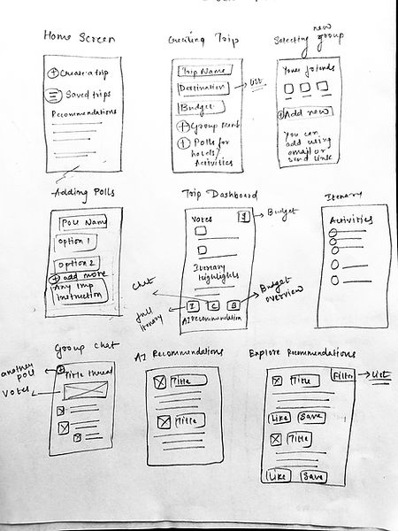
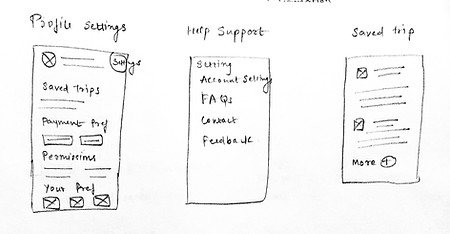
To get meaningful feedback and understand the misalignments in user flows, I chose to rapidly prototype my ideas using simple tools like pencil, paper, and eraser. This process later revealed the setbacks we were facing in our MVP.
Priortization Evaluation based on drafts
Low-Mid-High Fidelity

Making
Prototyping based on user flows

" I want to be able to save the restaurants and hotels recommendations. I also want to search for anything I know to plan a better Itinerary "

" I want to be able to designate different budgets for different categories and get a proper overview of the expenses I will make so I can save money to buy souvenirs"

" I want to know everyone's opinion on budget forming and restaurants for planning a trip that everyone loves and enjoys"
" I want to be able to see different curated itineraries so that I don't have to struggle to plan for the trip and get the best views for limited money. "

Testing
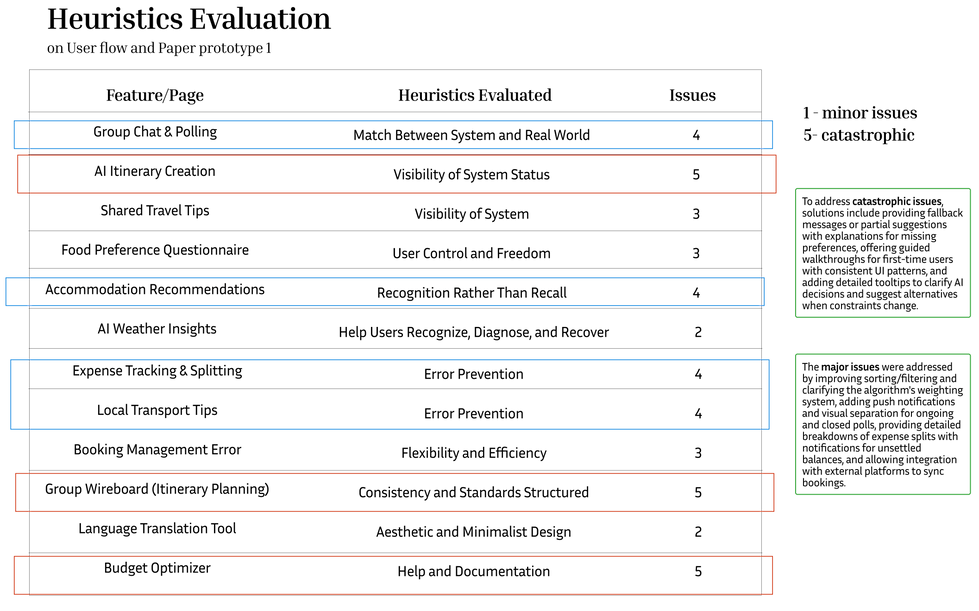
For testing, I began by gathering critiques from the internal stakeholders. We conducted multiple usability tests with several sets of users, each representing different personas. During the testing, we identified discrepancies in the user path analysis. I asked our team to rate the difficulty level of reaching the goal for each page within the user flow on a scale of 1 to 5 (1 being the lowest and 5 being the highest). After the testing refinements were made.
A/B Testing Examples on Usabilityhub

85% votes
10% votes
Users preferred having an image over just some graphics for welcome.
We saw unanimous voting from the user's side, and the stakeholders agreed to choose the page with the image instead. It was a win-win situation.
75% votes
20% votes
Users preferred having a color box for the categroies buttons instead of the underlined buttons.
Stakeholders felt that the version in the right was better but later chose to go with the user's perspective.
Since the startup is currently preparing for its launch and securing funding, I am unable to share the final, functioning prototype at this time. However, I can share a dummy prototype that demonstrates the designs shown above.

Takeaways
Inclusivity: I focused on incorporating perspectives from diverse personas to form the foundation of design decisions. When planning user stories, I ensured that various scenarios were carefully considered to create a well-rounded solution.
Startup Environment Design Decisions: In the fast-paced startup environment, it was challenging to gain substantial stakeholder alignment initially, as there was hesitation to spend too much time understanding the problem. To address this, I conducted several quick and effective research exercises to deliver meaningful insights within tight timelines.
Future Considerations: I emphasized building a product that could succeed as an MVP rather than striving for perfection in the initial stages. Travelanture has significant potential, and while it addresses critical issues, there’s a long journey ahead for it to become the best in the market.